FLANNELS Personal Shopping Elevation
Vision Statement:
Establish a strong foundation to position Personal Shopping as a core offering within Flannels In store from a online perspective, driving the growth of luxury Personal Shopping within the UK. This service will be available at flagship stores, including Liverpool and Leeds.
KPIs:
Personal shopping to represent 2% of Flannels’ luxury retail business by FY28 (£5m), highly profitable, elevated presence.
My Role
Product Designer
Design focus: Redesign Personal Shopping Service Offering on FLANNELS
Project responsibilities: Design, Content Square Analysis, Design feedback, Stakeholder updates, Design system, Developer feedback.
Methods: Content Square Analysis, Competitor Analysis, Usability Studies, Stakeholder meetings, Wireframing, Mockups, Prototyping, Testing.
Process
I applied the Double Diamond design process, progressing through Discovery, Define, Develop, and Deliver. Using Content square, I analysed user behavior to uncover navigation patterns and pain points, while UserTesting provided qualitative feedback from our target audience. These insights shaped the Define phase, where I prioritised key challenges. In Design, I iteratively refined prototypes based on user needs. Finally, I collaborated with cross-functional teams to deliver and optimise a redesigned user flow that met both customer and business goals.
Discovery
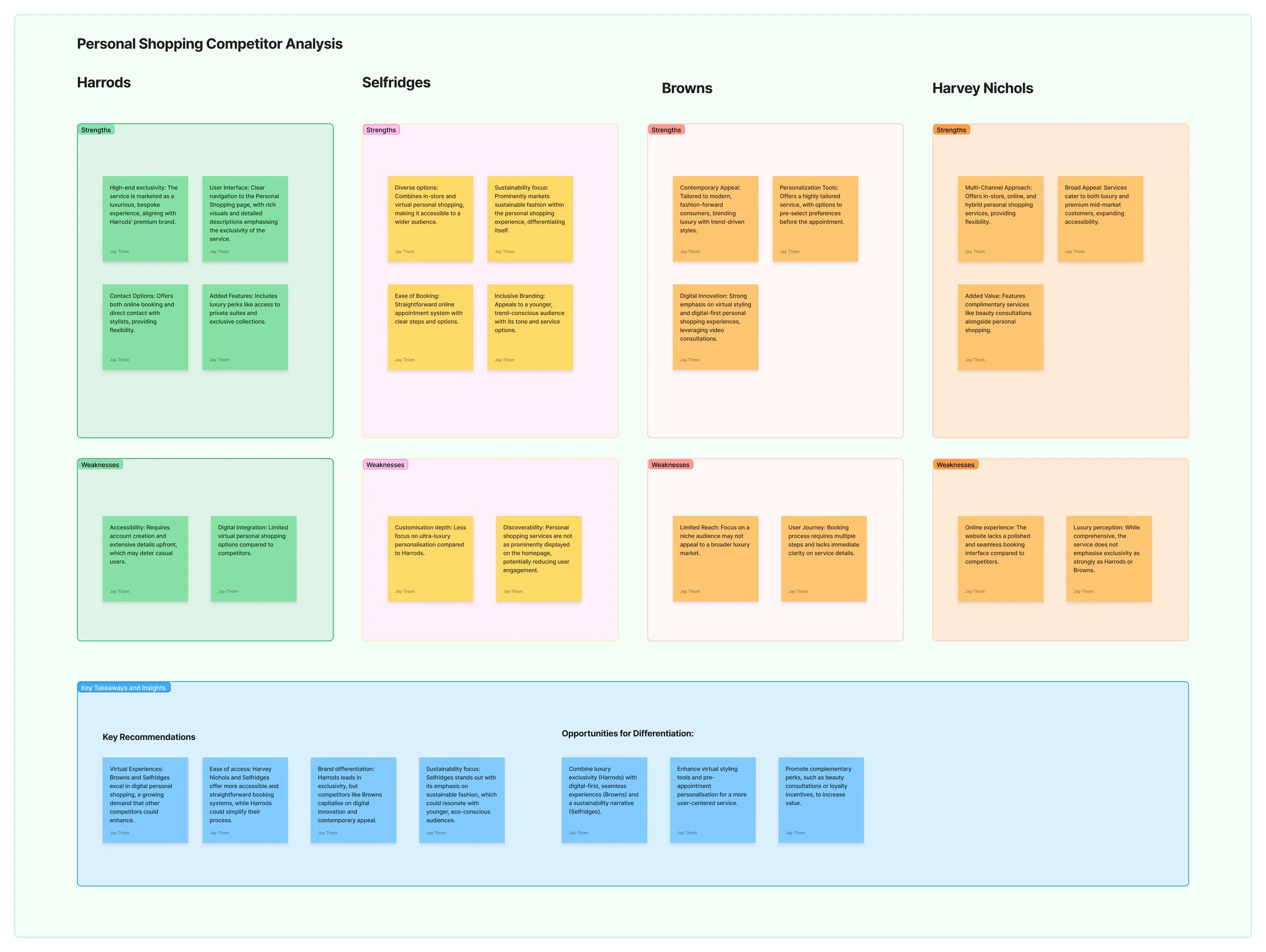
Competitor Analysis: I conducted a competitor analysis of four direct competitors: Harrods, Selfridges, Browns, and Harvey Nichols. This involved evaluating their services across key factors such as accessibility, user journey, digital integration, and brand positioning. I analysed how each brand leverages exclusivity, innovation, and personalisation to differentiate their offerings.
Key Takeaways
Virtual Experiences: Browns and Selfridges excel in digital personal shopping, a growing demand that other competitors could enhance.
Ease of Access: Harvey Nichols and Selfridges offer more accessible and straightforward booking systems, while Harrods could simplify their process.
Brand Differentiation: Harrods leads in exclusivity, but competitors like Browns capitalise on digital innovation and contemporary appeal.
Sustainability Focus: Selfridges stands out with its emphasis on sustainable fashion, which could resonate with younger, eco-conscious audiences
Contentsquare Analysis
I used Contentsquare to analyse the Personal Shopping user journey, focusing on the landing page and booking process. The analysis uncovered valuable insights into user behaviour, such as navigation patterns and drop-off points, highlighting friction in the booking steps and overlooked calls-to-action. These findings helped identify pain points and optimise the experience to boost engagement and ease of use.
Analysis Length: 30 Day analysis on 3 key metrics on the existing landing page
Key takeaways
Unlinked Icons Cause Confusion: Users frequently tap the ‘book’ icons, but they do not link anywhere, creating a frustrating experience.
Misleading Hero Banner: The hero banner receives clicks but redirects users to the homepage instead of progressing the booking journey.
CTA Placement Issues: The primary call-to-action (CTA) to book an appointment sees high engagement but is located at the bottom of the page, requiring users to scroll.
Tap Frustration: High tap recurrence on the hero asset and booking step icons indicates users expect these elements to be functional.
Limited Visibility of Key Actions: Only 62% of users scroll to the section with the CTA, and the lack of CTAs above the fold contributes to drop-offs further down the page.
-

Number of Taps
• High number of users are clicking the ‘book’ icon - however the icons don’t link anywhere.
• The hero banner is receiving some click interaction, but it currently redirects users to the homepage. Instead, it should guide them directly to the next stage of the booking process.• Main CTA to book an appointment has high number of taps but users have to scroll to be bottom
-

Tap Recurrence
• Hero asset and booking step icons are seeing a higher number than 1 indicating user tap frustration. This could be because the user is expecting the hero or icons to link somewhere.
• Booking step icons are being interacting with but don’t navigate anywhere.
-

Exposure Rate
• 62% of users landing on this page are scrolling to where the only CTA is on the page.
• No CTA’s above fold. Exposure rate declines further down the page where the main CTA is to book an appointment.
Problem Themes
UX/UI Improvements
Problem: The current design is not visually engaging or consistent, leading to a lack of trust and reduced engagement.
Goal: Refine the user interface to make it visually appealing, modern, and cohesive, aligning with the overall brand guidelines.
Page easy to navigate
Problem: Users struggle to find key information or perform essential actions due to a confusing layout and poor navigation structure.
Goal: Simplify the page structure and navigation, ensuring users can quickly locate relevant information or features without frustration.
Provide more information
Problem: Users feel uncertain about the personal shopping experience due to insufficient and confusing details provided on the page.
Goal: Include comprehensive, clear, and engaging content that answers common questions and reassures users about the benefits of the service.
Easily able to book an appointment
Problem: Users face friction when trying to schedule personal shopping appointments, resulting in drop-offs and missed opportunities.
Goal: Streamline the appointment booking process, enabling users to schedule with minimal effort and maximum convenience.
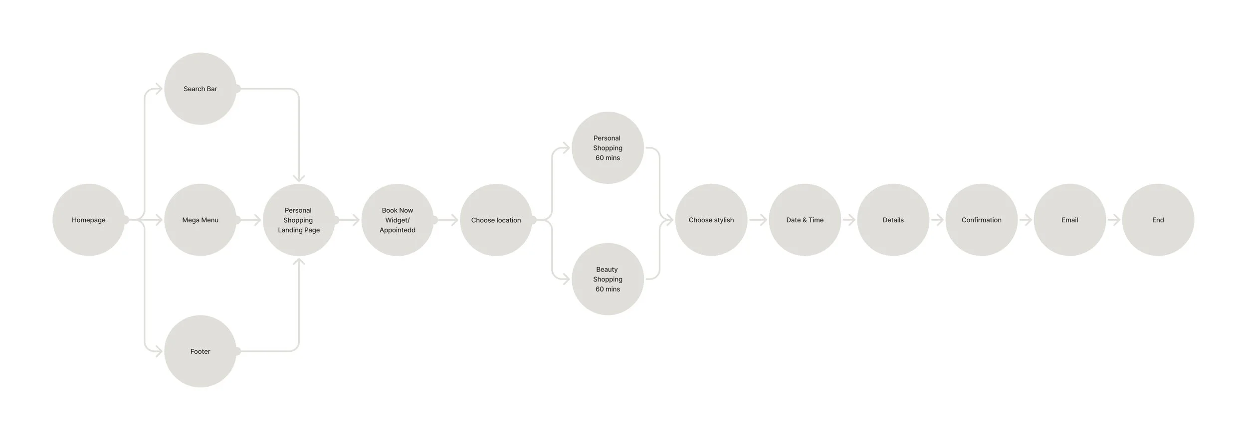
Userflow mapping
To gain a clear understanding of user journeys from site entry, I created this user flow map to visualise the steps a user takes from the homepage to booking the personal shopping service. This process revealed key pain points, notably that the service was difficult to discover—buried within the footer and mega menu—creating a potential barrier for customers looking to engage.
Ideation and Wireframing
Based on the findings from the discovery phase and the insights gathered so far, I began developing wireframes for the landing page. My focus was on exploring different layout options to ensure a smooth page flow while optimising it to feature all the necessary content.
I collaborated with various stakeholders, including the Head of Personal Shopping, the Business Transformation Manager, and the SEO team, to align on requirements. Some key elements included:
Types of Appointments – Personal Shopping (Virtual & In-store) and Beauty appointments, integrated with Appointedd, an online booking system.
Social Media Component – Showcasing Flannels’ Personal Shopping experience by pulling in customer-generated content via branded hashtags.
How It Works Section – A clear, easy-to-follow breakdown of the service process.
SEO-Optimised FAQ Section – Designed to provide customers with helpful and relevant answers to commonly asked questions.
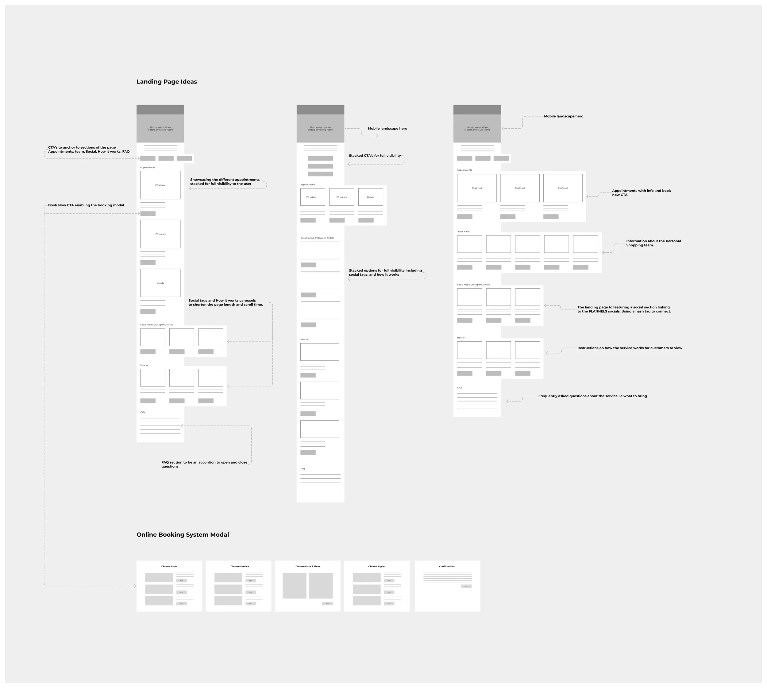
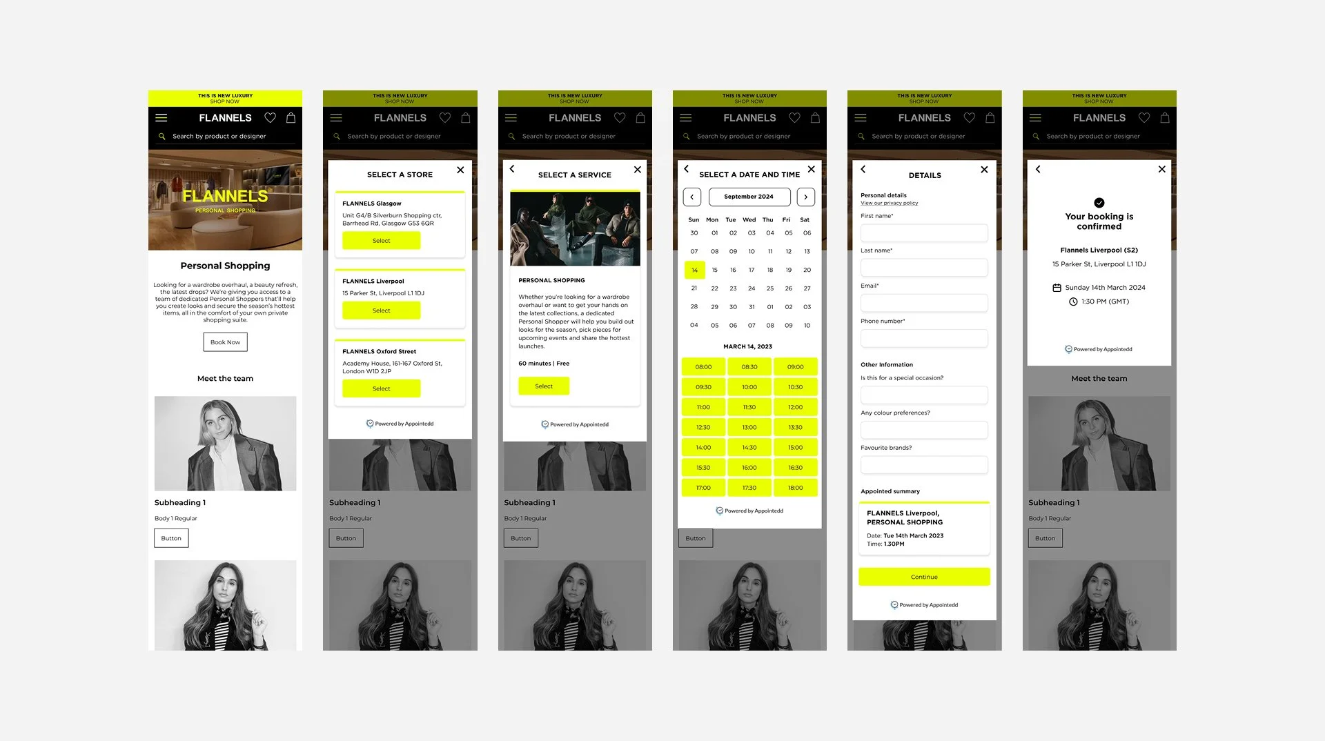
Booking System Widget with Appointedd
Working with Appointedd, an online booking system third-party company, to understand the requirements for this particular service. Collaborating with their front and back end teams, I provided designs and a direction for the widget, while ensuring alignment with brand guidelines. The booking modal features a 4-step process, including a confirmation step, and users also receive both SMS and email notifications upon completion.
Prototyping and user testing
Using the wireframes as a foundation, I created high-fidelity mockups for user testing to gain deeper insights and refine the designs. This step was crucial for validating the solutions we had developed based on discovery phase findings. While the testing confirmed the effectiveness of our approach, users highlighted a desire for more focus on learning about the Personal Shoppers and their expertise in style. Additionally, the feedback provided valuable insights into potential future solutions, guiding us in the ongoing development and optimisation of the Personal Shopping journey.
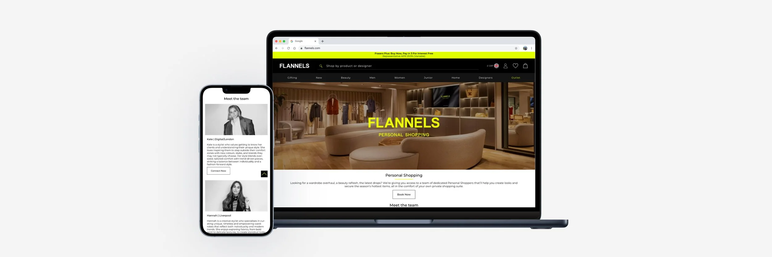
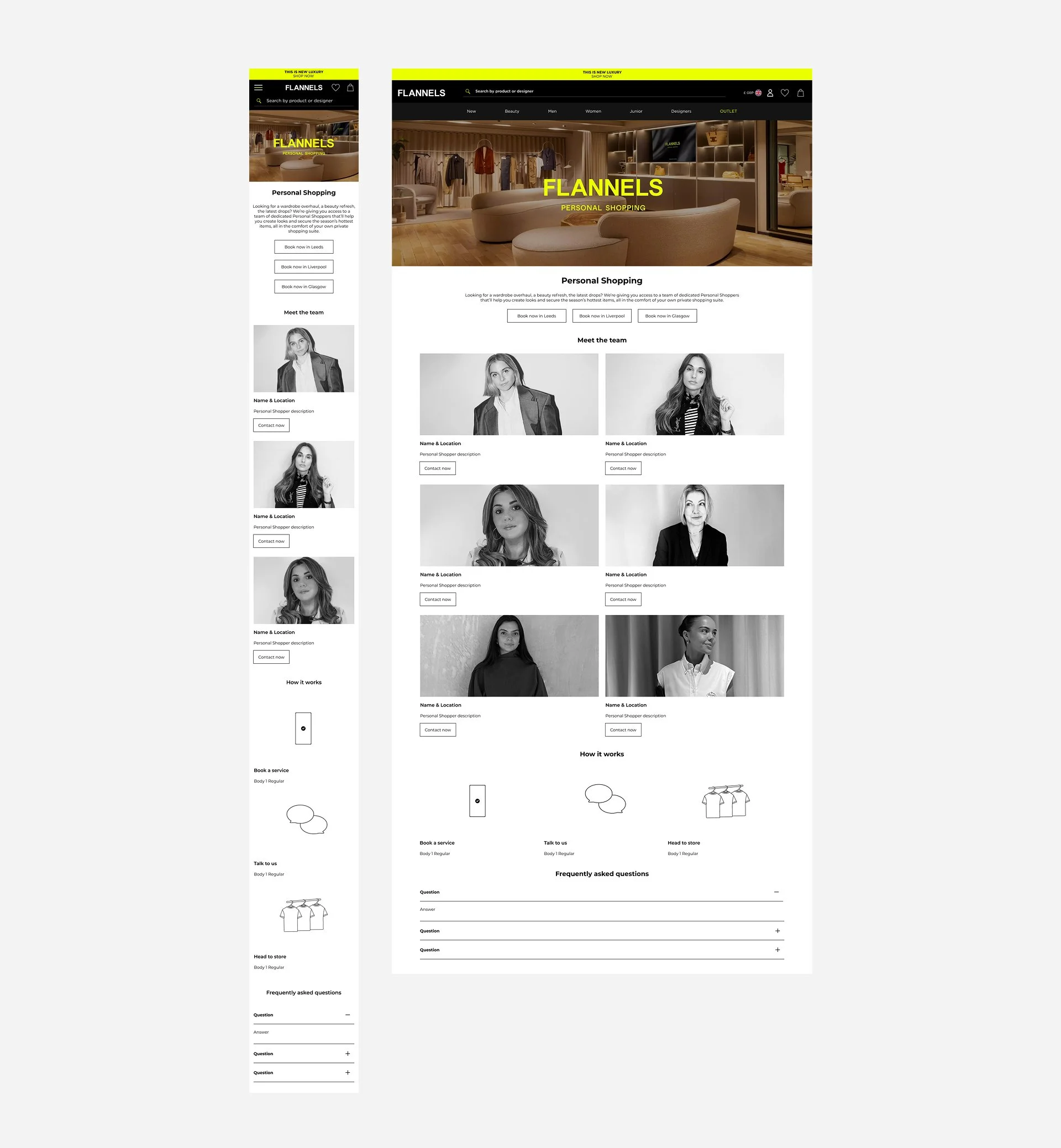
Final Design Minimum Marketable Product (MMP)
The final designs highlight key elements to enhance the personal shopping experience. On both desktop and mobile, the booking content is placed above the fold for easy access. The design emphasises service information and showcases the personal shoppers with bios and contact details, catering to the growing demand to highlight their personal brands and social followings. The page also includes digestible content, with a clear and helpful FAQ section.
To promote the new service, the CRM team sent geo-targeted emails, while the social media team actively shared posts to raise awareness and drive engagement.
Further analysis and next steps
After the product launch, I conducted a 30-day page analysis using ContentSquare to assess performance three months post-launch.
Key insights included:
The FAQ section received the most user interaction. To improve access, we could introduce an anchor component to allow users to jump directly to this section.
Some profiles lower on the page were tapped more frequently than others. We could optimise the team section by positioning the more engaged profiles higher up.
The exposure rate decreases as users scroll further down the page. To address this, we could implement A/B tests with anchors and carousels to reduce page length and surface high-engagement content higher up.
To increase engagement and length of stay on page, photography are shooting a video of the VIP suite and Personal Shopping area to feature in the hero slot.
-

Number of Taps
• High Tap Recurrence on Main CTA:
The 'Book Now' CTA has high tap recurrence, indicating users are stopping and retrying the booking process, likely due to friction or uncertainty.• Uneven Profile Engagement:
Some user profiles show higher engagement, suggesting an opportunity to personalise or better target specific segments.• FAQ Section Driving Recurrence:
The FAQ section sees the most taps, indicating users seek more information before proceeding, pointing to a need for clearer, more accessible details earlier in the journey. -

Tap Recurrence
• High Tap Recurrence on Main CTA:
The main 'Book Now' CTA showed tap recurrence above 1, suggesting users are stopping and retrying the booking process, indicating possible friction points.• Uneven Engagement Across Profiles:
Some user profiles are receiving more engagement than others, pointing to opportunities for personalization or targeted outreach.• Frequent Interaction with FAQs:
The FAQ section has the highest tap recurrence, implying users are seeking more information before proceeding, suggesting a need for clearer or more accessible details earlier in the process. -

Exposure Rate
• High Visibility of Main CTA:
97.9% of users see the main CTA, indicating strong visibility and engagement at the start of the journey.• Drop-off in Engagement:
Engagement drops significantly, with only 23.7% of users reaching the FAQ section, suggesting a high exit rate before users get further down the page.